Within Affiliate Engines
Why A Versus B Pages Drive Clicks
Comparison pages can convert well because the reader has already narrowed the decision to a few specific options.
On this page
- Readers who have already narrowed the market
- Fair trade offs instead of fake balance
- Where to place affiliate links in the decision
Page outline Jump by section
Introduction
Comparison pages for named alternatives — such as “Product A vs Product B”, “Brand X alternatives”, or “Tool A compared with Tool B” — are valuable affiliate pages because the reader has usually moved past general browsing. They are not asking “What is this category?” They are asking which named option deserves the next click. That makes the page commercially different from a broad guide: its job is to reduce uncertainty, explain trade-offs, and send the reader to the right merchant or sign-up page at the moment of decision.
For affiliate websites, this page type works best when it is genuinely comparative rather than disguised promotion. Search and usability evidence points in the same direction: users need clear attributes, scannable side-by-side information, and credible explanations of who each option is best for. Comparison tables are a recognised pattern for helping users compare products or services by attributes, but they only help when the criteria are relevant and the trade-offs are honest. [Nielsen Norman Group]nngroup.comNielsen Norman GroupComparison Tables for Products, Services, and FeaturesFebruary 9, 2024 — 9 Feb 2024 — A table that uses columns for p…
Readers who have already narrowed the market
A named comparison page captures a reader who has already done part of the commercial work. Someone searching for “ConvertKit vs Mailchimp”, “Dyson V15 vs V12”, “Squarespace alternatives”, or “Ninja air fryer vs Cosori” is not at the same stage as someone searching for “what is email marketing?” or “how do air fryers work?” They have named options in mind, which means the page can focus less on category education and more on final selection.
That matters for affiliate revenue because the conversion path is shorter. The reader already recognises the products, brands, or services. The page only needs to answer the unresolved question: “Which one fits my situation?” In practical terms, this makes named comparison pages useful bridge pages between informational traffic and affiliate clicks. They can receive internal links from broader guides, product reviews, “best for” roundups, and problem-specific pages, then pass qualified readers onwards to merchant pages.
The strongest comparison pages usually answer three questions quickly: [asa.org.uk]asa.org.ukSource details in endnotes.
- What is the practical difference? Not every specification matters. The page should surface the few differences that change the buying decision.
- Who should choose each option? A comparison that says one option is “best” for everyone is usually less useful than one that explains fit by use case, budget, skill level, compatibility, or risk.
- Where should the reader go next? Affiliate links should match the reader’s likely decision path, not interrupt the comparison before trust has been built.
This is why named comparison keywords often deserve their own page rather than being buried inside a general review. A reader comparing two known alternatives wants a direct decision aid, not a broad introduction. Nielsen Norman Group defines comparison tables as tables with products or services as columns and attributes as rows, allowing quick comparison of features and characteristics; that structure maps neatly to the way a reader is already thinking at this stage. [Nielsen Norman Group]nngroup.comNielsen Norman GroupComparison Tables for Products, Services, and FeaturesFebruary 9, 2024 — 9 Feb 2024 — A table that uses columns for p…

Why versus pages create stronger click opportunities
A versus page creates clicks because it sits near the point where indecision becomes action. The reader has narrowed the market but still wants reassurance. A good page gives them enough confidence to click through to a product page, pricing page, free trial, or merchant listing.
The mechanism is simple. Broad affiliate pages often need to generate interest before they can generate a click. Named comparison pages inherit interest from the search itself. The reader has already brought the alternatives to the page. The publisher’s role is to organise the choice.
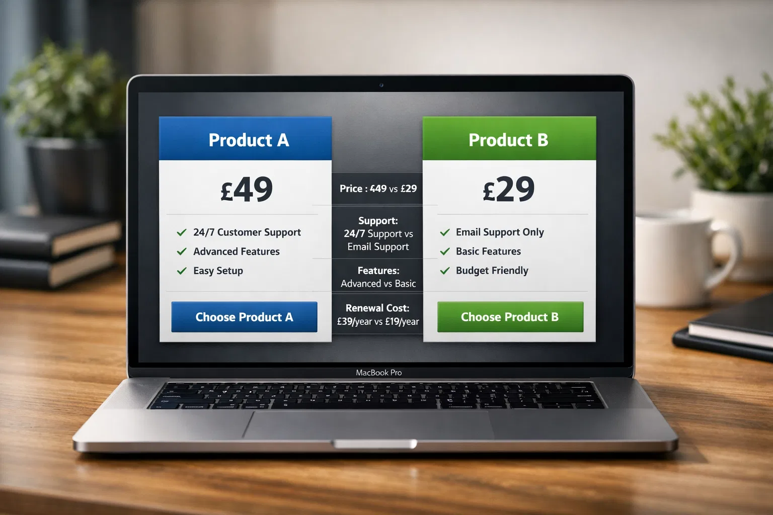
That organisation should be sharper than a generic pros-and-cons list. For a scalable affiliate site, a named comparison template should usually include:
- A short verdict near the top: not a hype claim, but a useful steer such as “choose A for lower upfront cost, B for stronger reporting”.
- A decision table: the attributes that most affect the purchase, such as price, warranty, supported platforms, battery life, integrations, dimensions, return policy, or learning curve.
- Use-case recommendations: “best for beginners”, “best for teams”, “best for small kitchens”, “best for heavy use”, depending on the category.
- Evidence notes: how the comparison was made, what data is current, and where uncertainty remains.
- Affiliate exits: links placed where the reader is ready to inspect price, availability, trial terms, or merchant details.
Baymard’s ecommerce research is useful here because it shows that comparison features are especially important for specification-heavy product types. In its testing, comparison features helped users weigh multiple attributes side by side, while poorly designed comparison tools could frustrate users and even lead them to abandon the site. [Baymard Institute]baymard.comuser friendly comparison toolsBaymard Institute4 Ways to Optimize the Comparison Feature for Scanning19 Oct 2022 — In this article, we'll discuss our Premium research…
The implication for affiliate pages is clear: a comparison page should not simply repeat two product descriptions. It should reduce the mental work of comparison. For software, that might mean pricing tiers, integrations, support, migration difficulty, and reporting depth. For physical products, it might mean size, weight, capacity, running cost, warranty, replacement parts, and merchant reliability. For financial or regulated categories, the trust burden is higher and the page should be more cautious about claims.
Fair trade-offs instead of fake balance
The best named comparison pages do not pretend every option is equal. They explain why one option is better for one reader and worse for another. Fake balance creates a weak page because it avoids the decision the visitor came to make. Fake certainty is just as bad, because it makes the page feel like an advert rather than a useful comparison.
A fair comparison has visible criteria. If a page recommends one product because it is cheaper, it should say whether that means lower monthly cost, lower lifetime cost, fewer paid add-ons, or a current promotional price. If it recommends a tool because it is “easier”, it should explain the evidence: fewer setup steps, simpler interface, stronger templates, better documentation, or a lower training burden.
Comparative review research also supports the value of attribute-based comparison. A 2024 study in Decision Support Systems reported that attribute-based comparative reviews had a more favourable influence on product sales than experience-based comparative reviews. In plain English, comparisons are more useful when they identify the concrete feature, benefit, or limitation being compared, rather than only describing a general feeling. [ScienceDirect]sciencedirect.comSource details in endnotes.
For an affiliate website, this creates a practical rule: each comparison should be built around decision attributes, not filler attributes. A mattress comparison should not give equal weight to brand story and sleep trial if most readers care more about firmness, return rules, cooling, delivery, and warranty. A web-hosting comparison should not overemphasise headline storage if the meaningful differences are renewal price, support quality, uptime evidence, staging tools, backups, and migration help.
Fairness also matters legally and reputationally. The UK Advertising Standards Authority says affiliate marketing is usually measured through click-throughs or sales and involves reward for attracting customers; where affiliate content falls within advertising rules, it must be identifiable as advertising. [ASA]asa.org.ukaffiliate marketingaffiliate marketing The FTC’s endorsement guidance similarly focuses on disclosing material connections between advertisers and endorsers. [Federal Trade Commission]ftc.govFederal Trade Commission FTC's Endorsement Guides: What People Are AskingFederal Trade Commission FTC's Endorsement Guides: What People Are Asking
The risk is not theoretical. In 2026, the ASA upheld a ruling involving Pets Corner after a pet food comparison site implied it was independent and did not make clear that it was owned by a retailer with commercial interests in the products compared. The ASA concluded that the ad falsely implied the business was acting outside its commercial purpose and was misleading. [ASA]asa.org.ukget yourself affiliated with the rules on affiliate marketingget yourself affiliated with the rules on affiliate marketing
For comparison pages, the lesson is simple: do not hide the commercial relationship, do not present owned or commercially favoured products as if they won a neutral test, and do not make a “best” or “cheapest” claim unless the basis is clear and verifiable.
What a useful named comparison page should compare
A comparison page should be designed around the reader’s decision, not around the publisher’s available affiliate programmes. Offer availability matters for monetisation, but the comparison itself must still make sense to the reader.
A practical comparison framework looks like this:
Decision trigger: Why would someone compare these named alternatives? They may be choosing between two popular products, switching from one tool to another, replacing a discontinued product, looking for a cheaper alternative, or trying to avoid a known weakness.
Core attributes: These are the criteria that change the decision. For consumer electronics, that might be battery life, weight, repairability, warranty, ecosystem compatibility, and real-world performance. For software, it might be pricing model, data export, integrations, support, user limits, and feature depth.
Reader segments: A good comparison rarely has only one winner. It may recommend one option for beginners, one for advanced users, one for lowest upfront cost, and one for long-term value.
Conversion exits: Each recommendation should connect to an appropriate affiliate offer. A “best for budget buyers” verdict should not send the reader to the most expensive merchant by default. A “best for business use” verdict should link to the right plan, trial, demo, or reseller page.
Freshness signals: Named comparison pages age quickly when prices, product versions, stock, plans, or policies change. The page should show update dates and avoid over-specific claims that cannot be maintained at scale.
Baymard’s benchmark data also shows why consistency matters. In product listing research, it found that poorly displayed list item information made products harder to evaluate and could lead users to disregard suitable options. [Baymard Institute]baymard.comuser friendly comparison toolsBaymard Institute4 Ways to Optimize the Comparison Feature for Scanning19 Oct 2022 — In this article, we'll discuss our Premium research… The same applies to affiliate comparison pages: if one option has detailed specifications and the other has vague prose, the comparison feels uneven even if the page is not intentionally biased.

Where to place affiliate links in the decision
Affiliate links on named comparison pages should appear where they help the reader act on a decision. The aim is not to scatter links everywhere. The aim is to match each link to a clear point in the user flow.
There are usually four strong placements.
First, place links in the early verdict box after the page has made a concise recommendation. This serves readers who already know enough and only need confirmation. The wording should be specific, such as “Check current price”, “View trial terms”, or “Compare plans”, rather than a vague “Learn more”.
Second, include links in the comparison table where the next action is natural. A table row about price can link to current pricing. A row about availability can link to a merchant listing. A row about free trials can link to the sign-up page. This is especially useful on mobile if the table is designed carefully and does not force the reader to scroll horizontally without context. Nielsen Norman Group recommends making mobile tables easier to use through techniques such as locking headers and allowing users to select subsets of data when tables are large. [Nielsen Norman Group]nngroup.comNielsen Norman GroupComparison Tables for Products, Services, and FeaturesFebruary 9, 2024 — 9 Feb 2024 — A table that uses columns for p…
Third, place links after use-case recommendations. This is often the strongest affiliate moment because the page has just resolved the reader’s question. For example: “Choose A if you need the cheapest entry plan”, followed by a link to A’s pricing page; “Choose B if you need advanced reporting”, followed by a link to B’s trial or demo.
Fourth, include a final decision section for readers who scroll to the end. This should not merely repeat the top verdict. It should summarise the trade-off and offer the most relevant exit paths.
The placement should also respect disclosure. Affiliate disclosure is not a decorative footer item. Research on affiliate disclosures has found that many users fail to understand short or unclear disclosures, and that only about a tenth of affiliate content studied on YouTube and Pinterest contained any disclosure at all. [arXiv]arxiv.orgSource details in endnotes. For a public-facing comparison page, the commercial relationship should be clear before the reader clicks, not hidden after the decision has been shaped.
How named alternatives fit a scalable affiliate site
Named comparison pages are especially useful in a website-generation system because they create repeatable patterns. Once a site has a validated structure for one category, it can often expand into adjacent comparisons without inventing a new page type each time.
A scalable comparison cluster might include:
- Direct versus pages: “A vs B”, focused on two named options.
- Alternative pages: “Best alternatives to A”, focused on readers dissatisfied with or priced out of one known option.
- Switching pages: “A to B migration”, useful for software and services where changing provider has friction.
- Category bridge pages: “A vs B vs C”, useful only when three options are commonly compared together and the table remains readable.
- Review-to-comparison paths: individual reviews that link to the relevant comparison page when the reader is likely to ask “How does this compare?”
This structure helps internal linking because each page has a clear role. A broad guide can link to a “best” page. A “best” page can link to individual reviews. Reviews can link to named comparisons. Named comparisons can link to merchants. The goal is not to trap the reader in a maze of pages, but to match the next internal link to the next likely question.
Google’s own guidance on helpful content says its ranking systems are designed to prioritise helpful, reliable information created to benefit people rather than content made primarily to manipulate rankings. [Google for Developers]developers.google.comSource details in endnotes. For affiliate comparison pages, that means the scalable pattern must still produce genuine decision value. A mass-produced page that swaps brand names into the same generic paragraphs is unlikely to satisfy a reader who is looking for a precise choice.

Common failure modes that reduce revenue
Named comparison pages can underperform even when they rank, because ranking is only one part of revenue. The page also has to earn the click and send the visitor to the right offer.
The most common failure modes are:
Comparing the wrong alternatives. Some pages are created because two brands have affiliate programmes, not because real users compare them. A strong topic selection system should look for evidence that the alternatives are actually substitutes.
Using generic criteria. If every comparison uses the same rows — price, features, ease of use, support — the page may miss the attributes that matter in that category. A camera comparison, a payroll software comparison, and a dog food comparison need different evidence.
Hiding the commercial angle. Weak disclosure can damage trust and create regulatory risk. UK guidance from the CMA and ASA says incentivised content should be clearly identifiable as advertising and should reflect genuine experience where experience is claimed. [GOV.UK]GOV.UKSocial media endorsements: guidance for content creatorsSocial media endorsements: guidance for content creators
Over-linking before the verdict. Too many affiliate buttons before the page has answered the reader’s question can make the page look like a doorway to merchants rather than a decision aid.
Making unverifiable claims. Claims such as “best”, “cheapest”, “highest quality”, or “most trusted” need a clear basis. ASA guidance on comparisons states that comparative claims must be clear, and recent ASA rulings show scrutiny of misleading or unverifiable comparative claims. [ASA]asa.org.ukOpen source on asa.org.uk.
Ignoring mobile comparison design. A wide desktop-style table can become unusable on a phone. For many affiliate sites, mobile traffic is too important for the comparison table to be an afterthought.
The repeatable pattern worth scaling
The comparison page pattern is worth scaling when it meets three conditions: the alternatives are genuinely comparable, the reader is close to a decision, and the page can make the choice clearer than a merchant page would. That is the commercial advantage of an independent affiliate page: it can compare across brands, explain trade-offs, and help the reader choose without pretending one product is perfect.
A strong named comparison page should therefore behave like a decision tool. It should open with a direct verdict, show the most important differences, explain who each option suits, disclose affiliate relationships clearly, and place links at points where the reader is ready to act. When this pattern is repeated across real comparison demand — not forced across thin or artificial keywords — it can form one of the highest-intent parts of an affiliate website.
The essential principle is that the page earns revenue by making the decision easier. The affiliate click is the result of that usefulness, not a substitute for it.
Amazon book picks
Further Reading
Books and field guides related to Why A Versus B Pages Drive Clicks. Use these as the next step if you want deeper reading beyond the article.
Don't Make Me Think, Revisited
Versus pages need fast scanning, clear choices, and frictionless next-click paths.
The Paradox of Choice
Explains why reducing choice complexity is central to effective A-versus-B affiliate pages.
Conversion Optimization
Comparison pages are conversion assets, so testing layout, link placement, and messaging matters.
Influence
Useful for understanding decision triggers, authority, social proof, and ethical persuasion in comparisons.
eBay marketplace picks
Marketplace Samples
Example marketplace items related to this page. Use the search link to explore similar finds on eBay.


Endnotes
-
Source: baymard.com
Title: user friendly comparison tools
Link: https://baymard.com/blog/user-friendly-comparison-toolsSource snippet
Baymard Institute4 Ways to Optimize the Comparison Feature for Scanning19 Oct 2022 — In this article, we'll discuss our Premium research...
-
Source: baymard.com
Title: Institute Always Provide Comparison Features for Spec-Driven
Link: https://baymard.com/blog/provide-comparison-featuresSource snippet
Baymard InstituteAlways Provide Comparison Features for Spec-Driven...September 6, 2022 — 6 Sept 2022 — 67% of participants used compari...
Published: September 6, 2022
-
Source: sciencedirect.com
Link: https://www.sciencedirect.com/science/article/abs/pii/S0167923624001209 -
Source: asa.org.uk
Title: affiliate marketing
Link: https://www.asa.org.uk/advice-online/affiliate-marketing.html -
Source: asa.org.uk
Title: get yourself affiliated with the rules on affiliate marketing
Link: https://www.asa.org.uk/news/get-yourself-affiliated-with-the-rules-on-affiliate-marketing.html -
Source: ftc.gov
Title: Federal Trade Commission FTC’s Endorsement Guides: What People Are Asking
Link: https://www.ftc.gov/business-guidance/resources/ftcs-endorsement-guides-what-people-are-asking -
Source: ftc.gov
Link: https://www.ftc.gov/business-guidance/advertising-marketing/endorsements-influencers-reviews -
Source: asa.org.uk
Link: https://www.asa.org.uk/rulings/pets-corner-uk-ltd-a25-1303337-pets-corner-uk-ltd.html -
Source: baymard.com
Title: Institute2 Key Design Principles for Product Listing Information (64
Link: https://baymard.com/blog/list-item-design-ecommerce -
Source: arxiv.org
Link: https://arxiv.org/abs/1809.00620 -
Source: developers.google.com
Link: https://developers.google.com/search/docs/fundamentals/creating-helpful-content -
Source: GOV.UK
Title: Social media endorsements: guidance for content creators
Link: https://www.gov.uk/government/publications/social-media-endorsements-guidance-for-content-creators/social-media-endorsements-being-transparent-with-your-followers -
Source: asa.org.uk
Title: comparisons general
Link: https://www.asa.org.uk/advice-online/comparisons-general.html -
Source: asa.org.uk
Link: https://www.asa.org.uk/codes-and-rulings/rulings.html?date_period=past_year&issue=&media_channel=&topic=B4EE02F4-85BA-4E11-BE65C57BF665194C%2CB9497F61-870A-4053-A85BC98F42051F66 -
Source: baymard.com
Link: https://baymard.com/ecommerce-design-examples/39-comparison-tool -
Source: baymard.com
Link: https://baymard.com/research/checkout-usability -
Source: baymard.com
Link: https://baymard.com/research/ecommerce-product-lists -
Source: baymard.com
Link: https://baymard.com/ecommerce-design-examples/product-table -
Source: baymard.com
Link: https://baymard.com/ux-benchmark -
Source: baymard.com
Title: ecommerce search query types
Link: https://baymard.com/blog/ecommerce-search-query-types -
Source: baymard.com
Title: desktop ux ecommerce
Link: https://baymard.com/blog/desktop-ux-ecommerce -
Source: baymard.com
Title: ecommerce navigation best practice
Link: https://baymard.com/blog/ecommerce-navigation-best-practice -
Source: baymard.com
Title: ecommerce compatibility databases
Link: https://baymard.com/blog/ecommerce-compatibility-databases -
Source: baymard.com
Title: current state product list and filtering
Link: https://baymard.com/blog/current-state-product-list-and-filtering -
Source: baymard.com
Link: https://baymard.com/resources -
Source: support.google.com
Link: https://support.google.com/merchants/answer/14620705?hl=en-GB -
Source: developers.google.com
Link: https://developers.google.com/search/docs/appearance/structured-data/product -
Source: GOV.UK
Link: https://www.gov.uk/cma-cases/social-media-endorsements -
Source: youtube.com
Link: https://www.youtube.com/watch?v=7vBIxJA6NaQ -
Source: assets.publishing.service.gov.uk
Link: [https://assets.publishing.service.gov.uk/media/5fe496018fa8f56af2a85fea/Appendix_P_-specialised_search_v.8_WEB.pdf](https://assets.publishing.service.gov.uk/media/5fe496018fa8f56af2a85fea/Appendix_P-_specialised_search_v.8_WEB.pdf) -
Source: assets.publishing.service.gov.uk
Link: https://assets.publishing.service.gov.uk/media/68b81754536d629f9c82aa16/Who_regulates_hidden_advertising.pdf -
Source: youtube.com
Link: http://www.youtube.com/watch?v=9QCRfyqKlYwSource snippet
How to Make an Affiliate Marketing Website | Passive Income Blueprint 2026...
-
Source: youtube.com
Link: http://www.youtube.com/watch?v=HkYQ6qc56hISource snippet
How To Make A Comparison Page In WordPress Fast...
-
Source: youtube.com
Title: How To Make A Comparison Page In Word Press Fast!
Link: http://www.youtube.com/watch?v=5MY5R4DO184Source snippet
How to Make a Price Comparison Affiliate Marketing Website | Full WordPress Tutorial (2025)...
-
Source: youtube.com
Link: http://www.youtube.com/watch?v=otERuPdI-3USource snippet
[PART 7] Create Affiliate Product Comparison Review Table in Wordpress FREE...
-
Source: youtube.com
Title: [PART 7] Create Affiliate Product Comparison Review Table in Wordpress FREE!
Link: http://www.youtube.com/watch?v=EzYzRu3Qtw4Source snippet
Create product comparison vs pages affiliate marketing website How To Make Affiliate Marketing Comparison Pages In WordPress 2025 (Quick...
-
Source: nngroup.com
Link: https://www.nngroup.com/articles/comparison-tables/Source snippet
Nielsen Norman GroupComparison Tables for Products, Services, and FeaturesFebruary 9, 2024 — 9 Feb 2024 — A table that uses columns for p...
Published: February 9, 2024
-
Source: nngroup.com
Title: Nielsen Norman Group Mobile Tables: Comparisons and Other Data Tables
Link: https://www.nngroup.com/articles/mobile-tables/ -
Source: asa.org.uk
Link: https://www.asa.org.uk/codes-and-rulings/rulings.html?date_period=past_year&issue=&media_channel=&topic=F9DA2FCE-F62F-49BE-AEC6BCF4FA07070A%2C3706465E-E1B2-4E6A-ABCB7AB8E256827E -
Source: asa.org.uk
Link: https://www.asa.org.uk/codes-and-rulings/rulings.html?date_period=past_year&issue=&media_channel=&topic=8826BD5B-0831-49D4-B2320D113773A3DA%2C7E2B6966-95A4-4509-AD744D6397CAC795 -
Source: asa.org.uk
Link: https://www.asa.org.uk/codes-and-rulings/rulings.html?q=Comparisons -
Source: asa.org.uk
Link: https://www.asa.org.uk/codes-and-rulings/rulings.html?date_period=past_year&issue=9EDD13C6-91FE-4698-A7517E0C28EB1729%2C&media_channel=&topic=3706465E-E1B2-4E6A-ABCB7AB8E256827E%2CB9497F61-870A-4053-A85BC98F42051F66 -
Source: shopify.com
Title: affiliate disclosure
Link: https://www.shopify.com/uk/blog/affiliate-disclosure -
Source: imd.org
Title: affiliate marketing
Link: https://www.imd.org/blog/marketing/affiliate-marketing/
Additional References
-
Source: researchgate.net
Link: https://www.researchgate.net/publication/385156670_Assessing_the_Influence_of_Product_Page_Design_on_Purchasing_Influence_of_Products_in_Online_Marketplaces -
Source: linkedin.com
Link: https://www.linkedin.com/pulse/asa-upholds-complaints-against-four-misleading-product-andrew-keogh-rbzee -
Source: stevens-bolton.com
Link: https://www.stevens-bolton.com/insights/102mqaf/asa-issues-first-rulings-under-new-lfh-advertising-restrictions/ -
Source: geniuslink.com
Link: https://geniuslink.com/blog/amazon-affiliate-disclosure-guide/ -
Source: asa.org.uk
Link: https://www.asa.org.uk/static/uploaded/3af39c72-76e1-4a59-b2b47e81a034cd1d.pdf -
Source: thebcma.info
Link: https://www.thebcma.info/onewebmedia/DOWNLOADABLE%20DOCUMENTS/BCMA%20Influencer%20Marketing%20Guidelines%20and%20Best%20Practice%20UK.pdf -
Source: linkbuildingjournal.co.uk
Link: https://linkbuildingjournal.co.uk/uk-disclosure-asa-cap/ -
Source: linkedin.com
Link: https://www.linkedin.com/pulse/google-seller-ratings-product-reviews-platform-tara-johnson -
Source: growbydata.com
Link: https://growbydata.com/googles-product-reviews/ -
Source: asa.org.uk
Link: https://www.asa.org.uk/rulings/grind-coffee-roasters-ltd-a25-1313854-grind-coffee-roasters-ltd.html
Topic Tree
Follow this branch
Parent topic
Affiliate EnginesRelated pages 8
- Best Lists What Makes a Best Of Page Convert?
- Intent Topics Which Affiliate Topics Are Worth Building?
- Offer Fit Are High Commissions Always Better?
- Revenue Model Why Equal Traffic Does Not Mean Equal Earnings
- Reviews Why Thin Reviews Fail Affiliate Buyers
- Support Pages Can Informational Pages Still Earn Revenue?
- Trust Rules How Affiliate Sites Keep Reader Trust
- User Journeys How Internal Links Create Affiliate Paths