Within Comparisons
Why One Winner Is Rarely Enough
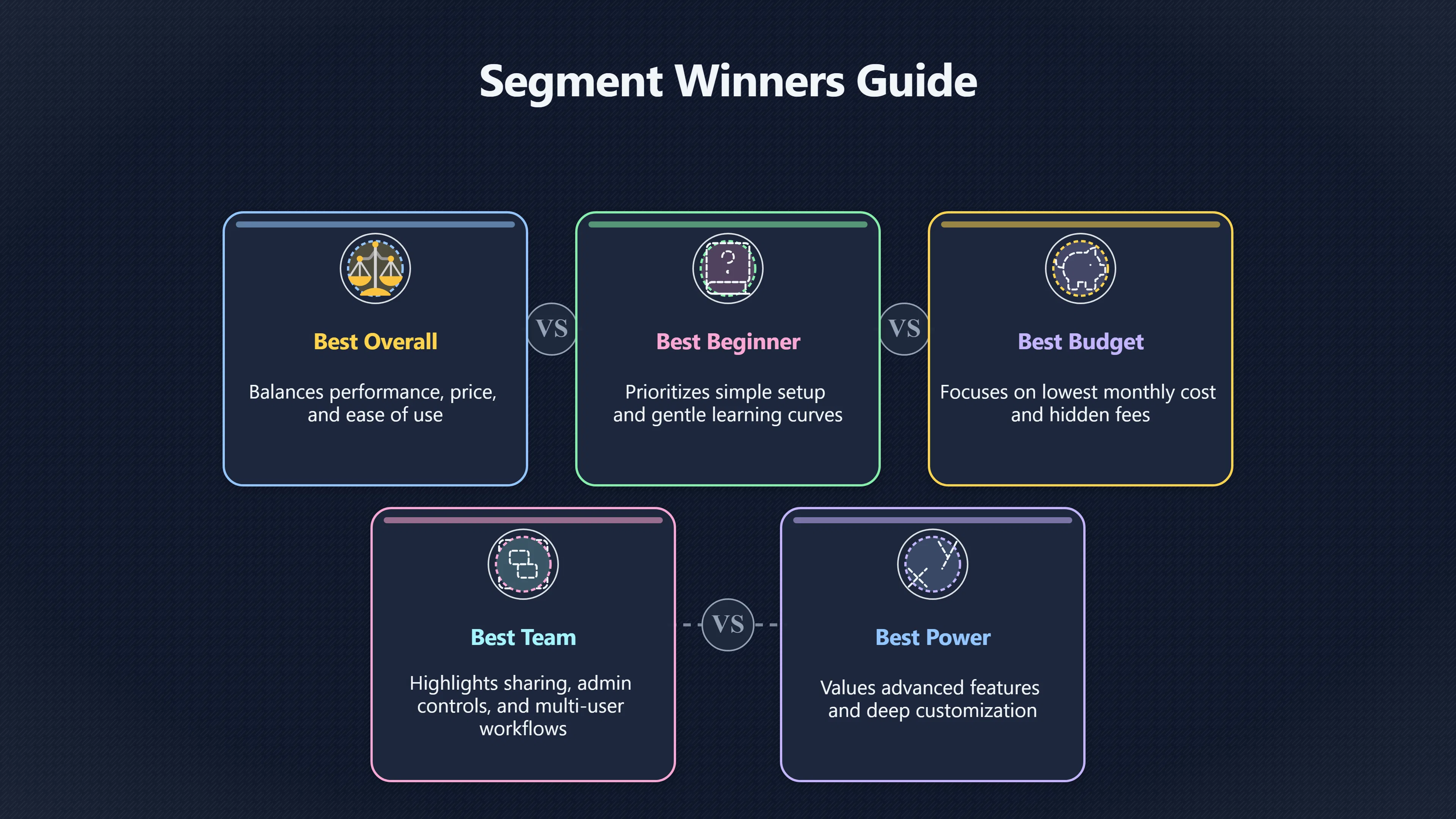
A comparison page can earn more trust by naming different winners for beginners, budget buyers, teams, or heavy users.
On this page
- How reader segments change the verdict
- Examples of useful best for labels
- Matching each segment to the right offer
Page outline Jump by section
Introduction
In the context of comparison pages for named alternatives on affiliate websites, naming a single “best” option rarely satisfies everyone. Readers differ sharply in budget, experience, priorities, and workflows — and a one‑size‑fits‑all verdict can leave a significant portion of your audience unconvinced and unreferred. Structuring your comparison to spotlight use‑case winners for different buyer segments turns a generic “Product A vs Product B” page into a decision aid that feels personalised, credible, and more likely to convert visitors into affiliate clicks and revenue.
 This page explains how effective use‑case segmentation works on comparison pages, why it matters for affiliate earnings, and how to match each segment to the right offer — turning a single piece of content into multiple micro‑recommendations that align with real reader intent. [Sense Central]sensecentral.comSense CentralHow to Make Product Comparison Pages Convert Better (Widgets That Help) - Sense CentralJanuary 12, 2026…
How Reader Segments Change the Verdict
Different visitors arrive at comparison pages with very different assumptions. Some know exactly what they want; others are still narrowing their choice. To earn trust — and clicks — your page should reflect those distinct use cases rather than treat all visitors as if their needs were identical.
Why “Best for Everyone” Falls Flat
A universal ranking assumes a single priority: performance, price, brand, or popularity. But most buying decisions involve trade‑offs:
- A beginner might prioritise ease of use and support over advanced features.
- A budget‑conscious buyer is focused on cost per month, free tiers, or hidden fees.
- A professional user or team may care most about integrations, scalability, or performance under load.
- An advanced or expert user may value customisation and advanced capabilities that a novice would never use.
Simply labelling one product “best overall” ignores these differences. Instead, top comparison pages explicitly segment the audience and assign use‑case winners — telling the reader “this is best if you’re X, that one suits Y better.” [Sense Central]sensecentral.comSense CentralHow to Make Product Comparison Pages Convert Better (Widgets That Help) - Sense CentralJanuary 12, 2026…
Evidence from Conversion Practice
Conversion optimisation research highlights this mechanism: pages that segment recommendations by use case — such as “Best for Beginners,” “Best Value,” “Best Premium” — consistently improve clarity and lower decision friction because users can immediately self‑select into the category that matches their needs. [Sense Central]sensecentral.comSense CentralHow to Make Product Comparison Pages Convert Better (Widgets That Help) - Sense CentralJanuary 12, 2026…
This self‑selection matters for affiliate revenue. A visitor who finds a recommendation tailored to their situation is more likely to click through, engage with the offer, and complete a purchase — shortening the path from search intent to conversion.
Examples of Useful “Best‑For” Labels
When naming winners for different buyer segments, clarity and relevance are key. Useful labels reflect common decision criteria rather than vague distinctions. Here are categories that consistently align with real reader intent:
- Best Overall: The choice that balances performance, features, price, and ease of use for most people.
- Best for Beginners: Easiest to adopt, with gentle learning curves and simple setup.
- Best Budget Option: Lowest cost — whether upfront, monthly, or total cost of ownership.
- Best for Teams/Collaborative Use: Robust sharing, admin controls, and multi‑user workflows.
- Best for Power Users/Professionals: Advanced features and customisation that experienced users value.
- Best for Specific Workflows: E.g., “Best for e‑commerce,” “Best for Small Business,” or “Best for Remote Teams” where specific behaviours change what’s most important. [Sense Central]sensecentral.comSense CentralHow to Make Product Comparison Pages Convert Better (Widgets That Help) - Sense CentralJanuary 12, 2026…
These labels should appear near the top of the page and be linked to anchor sections or CTAs that help different segments self‑identify quickly — deprioritising the one‑size‑fits‑all verdict in favour of personalised guidance.
Matching Each Segment to the Right Offer
Producing useful segment‑specific winners isn’t guesswork — it’s about mapping features and buyer priorities to expectation and value. A good comparison page does this in three linked stages:
- Define Segment Priorities: Start by understanding what matters most to each buyer type. For example, cost sensitivity for budget buyers; quick onboarding and support for beginners; extensive automations for advanced users.
- Surface Relevant Product Attributes: Align the features or attributes that matter for each segment. For example, “number of integrations” may matter more for teams than for hobbyist users.
- Explain the Recommendation: After naming a segment winner, briefly explain why this choice suits that segment best — the precise mechanisms that connect product features to the segment’s priorities.
For example, a “Best for Beginners” pick emphasizes intuitive UI, simple pricing, and readily accessible tutorials, whereas a “Best for Teams” pick highlights multi‑user support and advanced collaboration features.
This approach mirrors broader CRO best practice for comparison pages: guiding readers down self‑selected paths that reduce cognitive load while showcasing why each product “wins” for a clear, distinct use case. [Sense Central]sensecentral.comSense CentralHow to Make Product Comparison Pages Convert Better (Widgets That Help) - Sense CentralJanuary 12, 2026…

Why This Matters for Affiliate Revenue
Segmented use‑case winners are not just good UX; they are commercial assets. When you speak directly to what a reader cares about, you:
- Increase relevance: Readers see themselves in your copy and are more likely to engage the CTA.
- Reduce abandoned decisions: Instead of bouncing at “best overall” ambiguity, visitors can quickly identify the best fit.
- Target long‑tail intent: Many affiliate searches include modifiers like “for small business” or “on a budget.” Use‑case winners match these long‑tail queries and improve SEO relevance.
Comparison pages that incorporate segment winners help channel visitors from decision uncertainty to affiliate action more reliably than generic verdicts — directly boosting the traffic‑to‑affiliate conversion path.
Internal Link and Funnel Considerations
Comparison pages with segment winners also create valuable internal link opportunities. For example:
- Linking from broader guides (e.g., “Best CRM Tools”) to segment‑specific sections (e.g., “Best CRM for Freelancers”) enhances topical authority and funnels readers closer to conversion.
- Linking back to your site’s use‑case pages or buyer guides helps reinforce your hierarchy and keeps readers engaged within your content ecosystem.
This creates a conversion funnel that respects reader intent — from broad discovery through problem definition and finally to a tailored comparison that aligns closely with what they came to your site to resolve. [siteup.ai]siteup.aiThe Best Affiliate Page Types for AI Search Aren’t the Ones Most Publishers Start With | SiteUp.ai BlogMay 8, 2026…
Timing and Traffic Considerations
Not every comparison keyword warrants deep segmentation. Segment winners work best when:
- Search intent is already evaluative, meaning the visitor has narrowed options and wants a choice.
- The category has meaningful variation in price, feature depth, or user workflows.
- There’s sufficient search demand for segment‑specific queries (e.g., “best for beginners” or “budget option” modifiers).
When these conditions align, use‑case winners help you capture more of the decision‑ready traffic — the kind that turns into the highest value affiliate conversions.
Implementation Tips
To apply use‑case winners on your pages:
- Feature a “Quick Picks” section above the fold with segment winners and CTAs.
- Use anchor links so each segment winner smoothly takes the reader to the relevant details.
- Include clear explanation copy under each segment pick that justifies the recommendation in reader‑centric terms.
- Tie CTAs to offers that match the segment’s priorities (e.g., free trial for beginners, comparison sheet download for professionals).
These elements help your comparison page function not just as an informational asset but as a conversion‑optimised decision hub.

Ending Note
Readers arrive with different definitions of “best.” Comparison pages that respect that diversity by naming segment‑specific winners — and by explaining why each winner fits its segment — create a clearer decision experience and unlock more affiliate revenue opportunities than generic one‑size‑fits‑all verdicts. [serpranktracking.com]fivereviews.comserpranktracking.com Top Buyer Guide Formats That Help People Choose FasterBuyer Guide Formats That Help People Choose Faster - Five Reviews…
Amazon book picks
Further Reading
Books and field guides related to Why One Winner Is Rarely Enough. Use these as the next step if you want deeper reading beyond the article.
eBay marketplace picks
Marketplace Samples
Example marketplace items related to this page. Use the search link to explore similar finds on eBay.


Endnotes
-
Source: sensecentral.com
Link: https://sensecentral.com/how-to-make-product-comparison-pages-convert-better-widgets-that-help/Source snippet
Sense CentralHow to Make Product Comparison Pages Convert Better (Widgets That Help) - Sense CentralJanuary 12, 2026...
Published: January 12, 2026
-
Source: fivereviews.com
Title: serpranktracking.com Top Buyer Guide Formats That Help People Choose Faster
Link: https://fivereviews.com/top-buyer-guide-formats-that-help-people-choose-faster/Source snippet
Buyer Guide Formats That Help People Choose Faster - Five [Reviews]({{ 'reviews/' | relative_url }})...
-
Source: siteup.ai
Link: https://siteup.ai/blog/best-affiliate-page-types-for-ai-searchSource snippet
The Best Affiliate Page Types for AI Search Aren’t the Ones Most Publishers Start With | SiteUp.ai BlogMay 8, 2026...
Published: May 8, 2026
-
Source: shopify.com
Title: affiliate websites
Link: https://www.shopify.com/uk/blog/affiliate-websitesSource snippet
18 Affiliate Websites To Inspire Brands and Creators (2026) - Shopify UKMay 6, 2026 — 18 AFFILIATE WEBSITES TO INSPIRE BRANDS AND CREATOR...
Published: May 6, 2026
-
Source: hostinger.com
Link: https://www.hostinger.com/tutorials/?p=60970Source snippet
16min Read 20 BEST AFFILIATE MARKETING WEBSITES: EXAMPLES OF EXCELLENT MARKETING INITIATIVES Image: 20 best affiliate marketing websites...
Additional References
-
Source: searchfoundry.co.uk
Link: https://searchfoundry.co.uk/blog/winning-the-consideration-stage-a-blueprint-for-high-converting-comparison-and-alternative-pages/Source snippet
The Search FoundryMarch 19, 2026 — SEO 19 Mar 2026 33 min read WINNING THE CONSIDERATION STAGE: A BLUEPRINT FOR HIGH-CONVERTING COMPARISO...
Published: March 19, 2026
-
Source: neoearnings.com
Link: https://neoearnings.com/affiliate-marketing/best-landing-pages-for-affiliate-marketing/Source snippet
Affiliate Landing Page Examples That Made $50K+ (Real Results Inside) » NeoEarningsApril 22, 2025 — REAL AFFILIATE LANDING PAGE EXAMPLES...
Published: April 22, 2025
-
Source: blog.ranklayer.app
Title: comparison pages vs use case pages ai answer engines evaluation matrix
Link: https://blog.ranklayer.app/en/ai-search-visibility/comparison-pages-vs-use-case-pages-ai-answer-engines-evaluation-matrixSource snippet
Pages vs Use‑Case Pages for AI — 2026COMPARISON PAGES VS USE‑CASE PAGES FOR AI ANSWER ENGINES: A PRACTICAL EVALUATION MATRIX FOR SAAS FOU...
-
Source: growann.com
Title: Most of them are clear in design, simple, yet effective headlin
Link: https://www.growann.com/post/affiliate-marketing-landing-page-examplesSource snippet
9+ Best Affiliate Marketing Landing Page & Website ExamplesOctober 13, 2025 — 9 BEST EXAMPLES OF AFFILIATE MARKETING LANDING PAGES: Now...
Published: October 13, 2025
-
Source: graphically.io
Title: 12 Amazon Affiliate Website Examples You Need to Check Out
Link: https://graphically.io/blog/amazon-affiliate-website-examples/Source snippet
GraphicallySeptember 25, 2025 — 12 AMAZON AFFILIATE WEBSITE EXAMPLES YOU NEED TO CHECK OUT * Sathish * September 25, 2025 * No Comments K...
Published: September 25, 2025
-
Source: bestpage.ai
Title: 12 High-Converting Comparison Page Layouts | Best Page.ai
Link: https://bestpage.ai/learn/optimization-growth/comparison-page-layout-patternsSource snippet
12 High-Converting Comparison Page Layouts | BestPage.aiJanuary 30, 2026 — 12 HIGH-CONVERTING COMPARISON PAGE LAYOUTS Image: Yue ZhuYue Z...
Published: January 30, 2026
-
Source: blockagency.co
Title: 20 Affiliate landing page examples for fast sign-ups
Link: https://blockagency.co/blog/affiliate-landing-page-examples/Source snippet
Block AgencyDecember 26, 2025 — 20 AFFILIATE LANDING PAGE EXAMPLES FOR FAST SIGN-UPS December 26, 2025 · Landing page examples Image: 20...
Published: December 26, 2025
-
Source: averi.ai
Title: BOF U Content Strategy: The Pages That Actually Convert B2B Saa S Buyers
Link: https://www.averi.ai/blog/bofu-content-strategy-the-pages-that-actually-convert-b2b-saas-buyersSource snippet
You probably have a homepage, product pages, a blog full of educational content, and maybe a pricing pa...
-
Source: apexure.com
Link: https://www.apexure.com/landing-page-examples/active-landing-pageSource snippet
Design analysis covering comparison-driven conversion, affiliate CTA stra...
-
Source: internetmoneypro.com
Title: Affiliate Marketing Website Examples: What Working Sites Have in Common
Link: https://internetmoneypro.com/blog/affiliate-marketing-website-examplesSource snippet
1. WIRECUTTER — THE GOLD STANDARD FOR PRODUCT REVIEWS Wirecutter started as a one-person blog in 20...
Topic Tree