Within Comparisons
Where Should Comparison Pages Send Readers?
The right affiliate link appears when the reader is ready to check price, availability, trial terms, or merchant details.
On this page
- Matching exits to decision stage
- Price, trial, demo, and merchant detail links
- Avoiding premature clicks that weaken trust
Page outline Jump by section
Introduction
A named comparison page succeeds when its affiliate links appear at the same moment the reader is ready to act. Someone searching for “Product A vs Product B” is not usually looking for a random call to action. They are trying to resolve a specific decision. The highest-converting exits therefore tend to be the ones that answer the next question in the decision process: What does it cost? Can I try it? Can I see the full specification? Where can I buy it?
 This matters because comparison pages sit close to the purchase decision. Their role is not merely to generate clicks. Their role is to help the reader choose, then direct them to the most appropriate next step. When affiliate links interrupt the evaluation process too early, they can reduce trust and send users away before uncertainty has been resolved. Research on comparison-oriented interfaces consistently shows that users compare options by attributes and want information that supports decision-making rather than distractions. [Nielsen Norman Group]nngroup.comWhen You Don't Need a Comparison Table. There areNielsen Norman GroupComparison Tables for Products, Services, and FeaturesFebruary 9, 2024 — 9 Feb 2024 — They allow users to easily see…
Matching Exits to Decision Stage
The most useful way to think about affiliate exits is as a continuation of the comparison rather than a separate monetisation event.
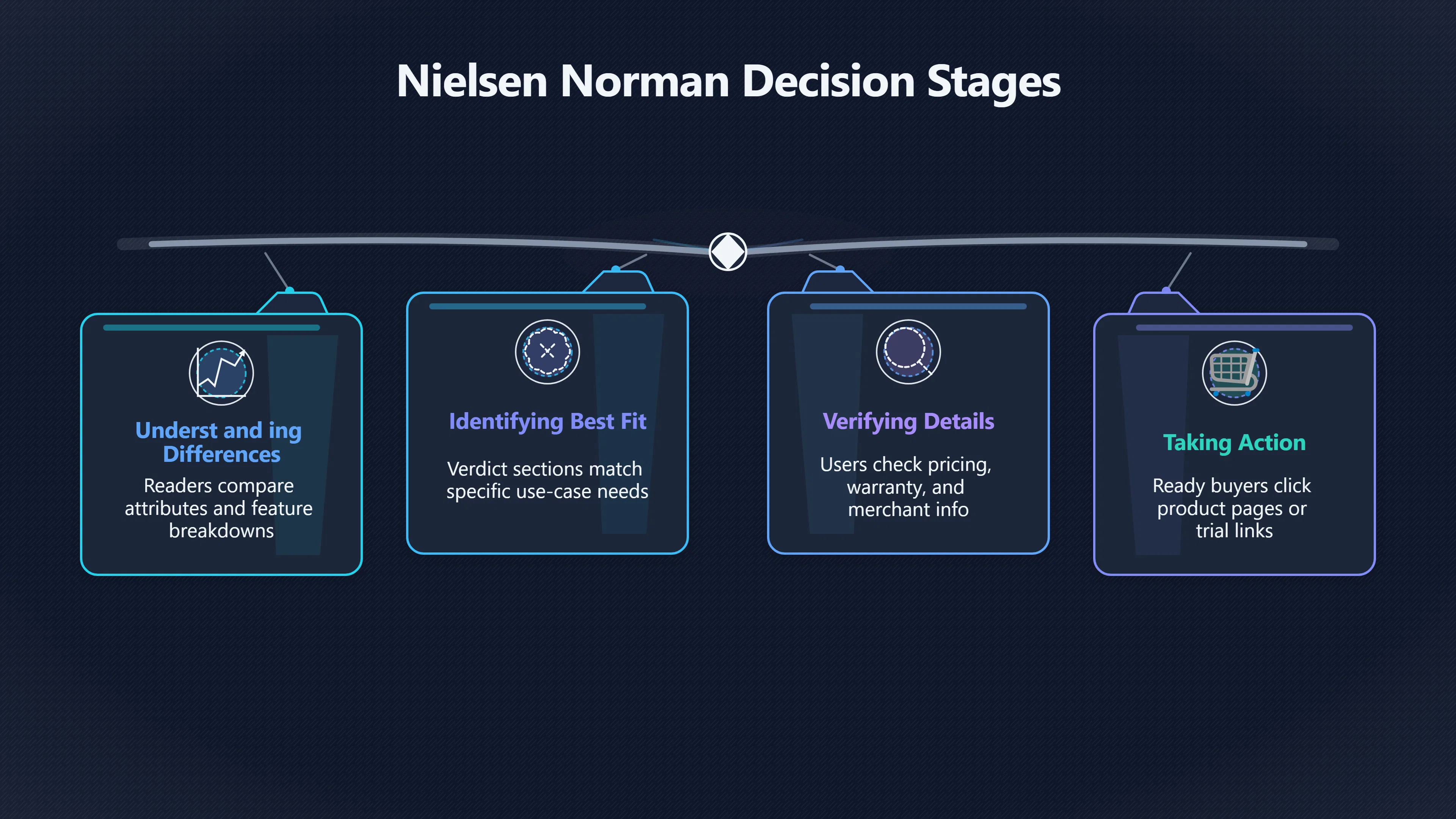
On a comparison page, readers often move through four stages:
- Understanding differences.
- Identifying the best fit.
- Verifying details.
- Taking action.
Each stage suggests a different type of affiliate exit.
Reader questionBest exit type“What is the difference?”Internal comparison content, feature breakdowns, decision tables“Which one fits me?”Verdict sections and use-case recommendations“Can I verify this?”Pricing pages, official feature pages, merchant details“Am I ready to buy?”Product pages, trial sign-ups, retailer offers
The mistake many affiliate sites make is jumping directly from stage one to stage four. A reader still comparing options often prefers verification links before purchase links. Allowing that verification step can increase confidence and improve the quality of the click.
Comparison-table research highlights that users rely on side-by-side evaluation when several factors contribute to a decision. The next click should therefore continue that evaluation rather than prematurely ending it. [Nielsen Norman Group]nngroup.comWhen You Don't Need a Comparison Table. There areNielsen Norman GroupComparison Tables for Products, Services, and FeaturesFebruary 9, 2024 — 9 Feb 2024 — They allow users to easily see…
Price, Trial, Demo, and Merchant-Detail Links
Different affiliate exits work best for different product categories because the reader’s final uncertainty varies.
Price-Checking Exits
For many consumer purchases, price becomes the final deciding factor.
A comparison page discussing two vacuum cleaners, laptops, or kitchen appliances may establish that both options are suitable. The unresolved question becomes whether the price difference is justified.
In this situation, affiliate links labelled around pricing intent often align well with user expectations:
- Check today’s price
- View current offers
- Compare retailer pricing
- See available configurations
The click is a natural continuation of the decision process because the reader has already accepted that the product is relevant.
Trial and Sign-Up Exits
Software and subscription services often create a different pattern.
A reader comparing two email marketing platforms, website builders, or CRM systems may not be ready to purchase immediately. Instead, they want practical experience.
For SaaS comparisons, exits leading to:
- Free trials
- Free plans
- Product demos
- Account creation pages
often align better with user intent than direct sales messaging. SaaS affiliate programmes frequently reward trial registrations or qualified sign-ups because testing the product is a normal step in the buying journey. [Trackier]trackier.comultimate guide to saas affiliate marketingTrackierUltimate Guide to SaaS Affiliate Marketing in 2026March 28, 2026 — 28 Mar 2026 — Learn how SaaS affiliate marketing works, top st…
A comparison page that recommends one tool for beginners and another for advanced users can therefore place trial links directly beneath the recommendation, matching the user’s likely next action.
Merchant-Detail Exits
Some readers simply need reassurance.
They may want to verify:
- Warranty terms
- Delivery information
- Return policies
- Supported integrations
- Technical specifications
These readers are not resisting conversion. They are reducing risk.
Sending them to merchant-detail pages or official product information can be more effective than pushing an immediate purchase link. Ecommerce usability research repeatedly shows that shoppers rely on detailed product information and comparison capabilities when making purchase decisions. [Nielsen Norman Group]nngroup.comWhen You Don't Need a Comparison Table. There areNielsen Norman GroupComparison Tables for Products, Services, and FeaturesFebruary 9, 2024 — 9 Feb 2024 — They allow users to easily see…

Avoiding Premature Clicks That Weaken Trust
One of the easiest ways to reduce comparison-page performance is to place aggressive affiliate calls to action before the page has completed its comparison function.
Readers arriving from a named comparison search often expect:
- A verdict.
- A clear explanation of differences. [youtube.com]youtube.comExplicit Decisions: Help Your Users Choose CorrectlyMake sure your users make the correct decisions the first time by making distinctions…
- Evidence supporting the recommendation.
- A fair assessment of trade-offs.
If the first screen is dominated by buttons urging them to buy immediately, the page can appear promotional rather than comparative.
This creates a trust problem. The user may suspect the recommendation was chosen to generate commissions rather than to help them make a decision.
Nielsen Norman Group’s research on comparison experiences emphasises that users need clear distinctions between options and information that helps them choose correctly. When key differences are hidden or unclear, decision quality suffers. [Nielsen Norman Group]nngroup.comWhen You Don't Need a Comparison Table. There areNielsen Norman GroupComparison Tables for Products, Services, and FeaturesFebruary 9, 2024 — 9 Feb 2024 — They allow users to easily see…
For affiliate comparison pages, that suggests a simple rule:
Resolve the comparison before maximising the click.
The reader should feel that the recommendation was earned through evidence, not forced through button placement.

Structuring Exits Around Comparison Outcomes
A scalable affiliate publishing system benefits from standardising exit placement according to the outcome of the comparison.
A useful pattern is:
Winner identified
→ Link to pricing, trial, or merchant page.
Close contest
→ Provide separate exits for each option with clear use-case labels.
[Different users need different products]nngroup.comWhen You Don't Need a Comparison Table. There areNielsen Norman GroupComparison Tables for Products, Services, and FeaturesFebruary 9, 2024 — 9 Feb 2024 — They allow users to easily see…
→ Attach exits to audience segments rather than a single winner.
For example:
- Best for beginners → Start free trial.
- Best for large teams → View pricing.
- Best budget option → Check current price.
This approach preserves the integrity of the comparison while still creating multiple affiliate opportunities.
It also scales well across large content portfolios because the exit logic is driven by comparison outcomes rather than arbitrary button placement.
The Goal Is Not More Clicks, But Better Clicks
A comparison page generates the most affiliate value when the exit matches the reader’s unresolved question.
If the reader needs pricing, send them to pricing.
If they need proof, send them to specifications or merchant details.
If they need experience, send them to a demo or free trial.
If they have already decided, send them directly to the purchase page.
The highest-performing affiliate exits are usually the ones that feel least like advertisements. They feel like the obvious next step in the decision journey. By aligning exits with comparison intent, a website can improve user trust, create smoother navigation paths, and increase the proportion of clicks that turn into genuine conversions rather than abandoned visits.
Amazon book picks
Further Reading
Books and field guides related to Where Should Comparison Pages Send Readers?. Use these as the next step if you want deeper reading beyond the article.
Dotcom Secrets
Covers funnel optimization and directing traffic to conversion-ready exits
Expert Secrets
Teaches guiding prospects through stages to maximize affiliate conversions
Traffic Secrets
Provides insight into directing high-intent visitors to the right affiliate exit pages
eBay marketplace picks
Marketplace Samples
Example marketplace items related to this page. Use the search link to explore similar finds on eBay.


Endnotes
-
Source: nngroup.com
Title: When You Don’t Need a Comparison Table. There are
Link: https://www.nngroup.com/articles/comparison-tables/Source snippet
Nielsen Norman GroupComparison Tables for Products, Services, and FeaturesFebruary 9, 2024 — 9 Feb 2024 — They allow users to easily see...
Published: February 9, 2024
-
Source: trackier.com
Title: ultimate guide to saas affiliate marketing
Link: https://trackier.com/ultimate-guide-to-saas-affiliate-marketing/Source snippet
TrackierUltimate Guide to SaaS Affiliate Marketing in 2026March 28, 2026 — 28 Mar 2026 — Learn how SaaS affiliate marketing works, top st...
Published: March 28, 2026
-
Source: nngroup.com
Title: Help them by answering questions, enabling comparison, providing
Link: https://www.nngroup.com/articles/ecommerce-product-pages/Source snippet
Nielsen Norman GroupUX Guidelines for Ecommerce Product PagesNovember 24, 2019 — 24 Nov 2019 — Summary: Customers shopping online rely on...
Published: November 24, 2019
-
Source: nngroup.com
Title: Nielsen Norman Group Explicitly State the Difference Between Options
Link: https://www.nngroup.com/articles/explicit-differences/Source snippet
Nielsen Norman GroupExplicitly State the Difference Between OptionsAugust 23, 2024 — 23 Aug 2024 — Summary: When the key differences betw...
Published: August 23, 2024
-
Source: linkedin.com
Link: https://www.linkedin.com/posts/nielsen-norman-group_comparison-tables-for-products-services-activity-6244577571720216577-U-vcSource snippet
Nielsen Norman Group's PostConsistency in content, scannability, and a simple layout are some of the most important qualities of successf...
Additional References
-
Source: impact.com
Link: https://impact.com/partnerships/ultimate-guide-to-saas-affiliate-marketing/Source snippet
The ultimate guide to B2B SaaS affiliate marketingRead this ultimate guide to SaaS affiliate marketing to discover the fundamentals & bes...
-
Source: linkedin.com
Link: https://www.linkedin.com/posts/nielsen-norman-group_comparison-tables-for-products-services-activity-7164262029220909057-JpKsSource snippet
LinkedInComparison Tables for Products, Services, and FeaturesComparison is one of the most critical activities users perform on the web...
-
Source: youtube.com
Link: https://www.youtube.com/watch?v=4f8Kzf3Y_l0Source snippet
3 Rules for Better Comparison TablesKate (Meyer) Moran explains how successful [comparison tables]({{ 'tables/' | relative_url }}) help people make decisions quickly. Simp...
-
Source: youtube.com
Link: https://www.youtube.com/watch?v=POsaV2YzRr8Source snippet
Comparison Tables: 5 Scenarios When Not to Use ThemUse these five questions to help you decide whether or not a comparison table would be...
-
Source: youtube.com
Link: https://www.youtube.com/watch?v=ahQ8tRIZwh0Source snippet
Explicit Decisions: Help Your Users Choose CorrectlyMake sure your users make the correct decisions the first time by making distinctions...
-
Source: medium.com
Link: https://medium.com/archilyse/comparison-tables-in-property-search-da78f258e6c4Source snippet
Comparison Tables in Property Search | by MargareteGood comparison tables, especially in property search, can help to reduce cognitive bi...
-
Source: irev.com
Link: https://irev.com/blog/15-free-affordable-affiliate-tracking-software-worth-using/Source snippet
Check out our list of 15 free and affordable tools perfect for startups and growing affiliate...
-
Source: fluentaffiliate.com
Title: Explore affiliate marketing and start scaling your business
Link: https://fluentaffiliate.com/affiliate-marketing-101/Source snippet
Affiliate Marketing 101: A Complete Beginner-to-Strategic...This Affiliate Marketing 101 guide is designed to give you a clear, practica...
-
Source: nngroup.com
Title: Comparison Tables for Products, Services, and Features
Link: https://www.nngroup.com/topic/comparison/Source snippet
comparison Articles, Videos, Reports, and Training CoursesUsers approach these tools with an exploratory mindset and appreciate them whil...
-
Source: uxlift.org
Title: comparison tables for products services and features
Link: https://www.uxlift.org/articles/comparison-tables-for-products-services-and-features/Source snippet
Comparison Tables for Products, Services, and FeaturesFeb 9, 2024 — Use this versatile GUI tool to support users when they need to make a...
Topic Tree